Responsive web design is essential for modern websites in 2026. With users browsing on smartphones, tablets, laptops, and desktops, websites must adapt to different screen sizes automatically. Responsive design ensures your content looks good and functions properly across all devices.
A responsive website adjusts layout, images, and navigation based on device screen size, providing a consistent experience without creating separate mobile and desktop versions.
Why Responsive Web Design Matters
- Improves mobile usability
- Enhances user experience
- Boosts SEO rankings
- Reduces bounce rate
- Supports mobile-first indexing
Google prioritizes mobile-friendly websites for indexing and ranking, making responsive design critical for SEO success.
Core Principles of Responsive Design
1. Fluid Grid Layout
Responsive design uses flexible layouts instead of fixed widths, allowing content to scale across devices.
2. Flexible Images
Images automatically resize to fit screen size without breaking layout.
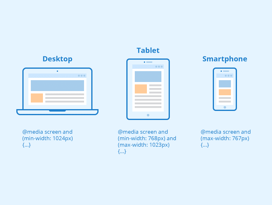
3. Media Queries
CSS media queries apply different styles based on screen size.
These three pillars—fluid grids, flexible media, and media queries—form the foundation of responsive web design.
Benefits of Responsive Web Design
Better User Experience
Users can read content without zooming and navigate easily on mobile devices.
Improved SEO Performance
Responsive websites improve crawlability, engagement, and search rankings.
Faster Loading Speed
Responsive design reduces redirects and optimizes content for devices.
Lower Bounce Rate
Users stay longer when the layout works properly.
Responsive design improves engagement metrics like bounce rate and session duration, which positively affect rankings.
Responsive Web Design Best Practices
- Use mobile-first approach
- Optimize images
- Use flexible typography
- Implement responsive navigation
- Test on multiple devices
- Use CSS Grid and Flexbox
- Avoid fixed width elements
- Enable lazy loading
Modern responsive techniques include CSS Grid, Flexbox, and responsive images for better performance.
Mobile-First Design Approach
Mobile-first design means designing for small screens first and then scaling up for larger devices. This improves performance and prioritizes essential content.
Tools to Test Responsive Design
- Google Mobile Friendly Test
- Chrome DevTools
- Responsive Design Checker
- BrowserStack
Common Responsive Design Mistakes
- Fixed width layout
- Large images
- Small clickable buttons
- Hidden mobile content
- Slow loading elements
Final Thoughts
Responsive web design is no longer optional in 2026. A mobile-friendly website improves user experience, boosts SEO rankings, and increases engagement. Implement responsive design best practices to ensure your website performs well across all devices.
Read more : pxless: The Complete 2026 Guide to Pixel-Free Web Design, Development & SEO